PAFnow Histogram Slicer
With the PAFnow Histogram Slicer, you can view the distribution of your cases in terms of numerical attributes and use the visualization to quickly and easily set filters and select cases. You can find the PAFnow Histogram Slicer on the Lead Times Report Page.
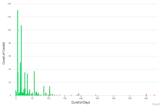
If you have selected the lead time as the numeric attribute, the Histogram Slicer gives you an overview of how long your cases need for the process, and where the majority and outliers are in the distribution. You can use this information as a basis for further filtering and select only those cases that are of interest for your further analysis.
This is the icon of the PAFnow Histogram Slicer in the Visualizations pane:
![]()
How to get started
To use the PAFnow Histogram Slicer to display your cases based on a numerical attribute and to set filters, you must first drag the necessary fields into the respective buckets.
Example
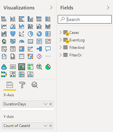
X-Axis: Drag-and-drop any numeric field into the X-Axis bucket under Visualizations (e.g. DurationDays from the Cases table to see the distribution of all cases according to their lead time).
Y-Axis: Drag-and-drop, CaseId from the Cases table into the Y-Axis bucket under Visualizations and select Number (unique) from the drop-down-menu.
How to use
Once you have selected the necessary fields for the PAFnow Histogram Slicer, you can start to use it to select/filter your cases.
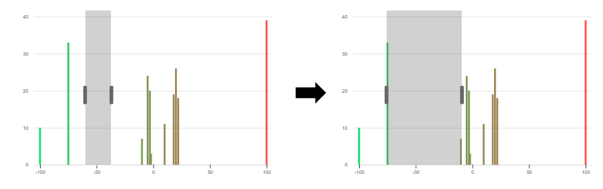
Cases with a lead time between -20 to 100 days are selected: 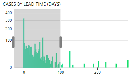
Cases with a lead time between 200 and 250 days are selected: 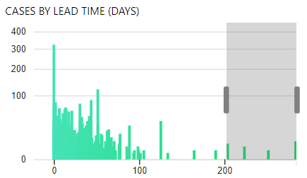
Cases with a lead time between -60 and -40 days are selected: 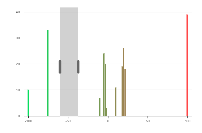
Filter
Filter the cases that are interesting for your analysis based on their distribution. Drag the cursor over the bucket that interests you. The selected bucket is highlighted in gray, so that you can exactly understand which cases you are currently filtering. You can also expand and/or move the bucket to the left and right if you want to customize your selection.
If you want to clear the filter, left-click outside the gray bucket on the background of the PAFnow Histogram Slicer.
Drilldown/Drillup
Using drillup and drilldown you can access the attribute (this way going to the next or to the previous attribute) that you want to filter. Expand down is not supported.
Example
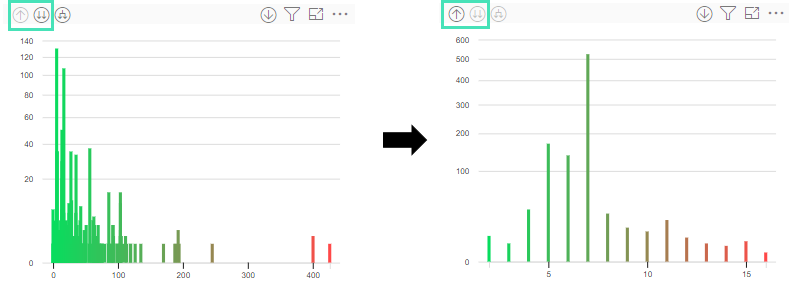 After clicking the drilldown-icon the Histogram Slicer shows a lower layer of the data.
Snap to nearest values
When Snap to nearest values in Brush Settings is enabled, the brush automatically snaps to the next lower and or upper value which can be filtered.
Example
 As no cases can be found in between the selected area (right around -50) the snap function selects the area -75 and -10.
Specification
Required Fields
In order to use the Histogram Slicer, you have to drag the required fields into the respective buckets.
| Name | Type | Description |
|---|---|---|
| X-Axis | Numerical | Use any numerical field from the PAFnow Data Model. |
| Y-Axis | Numerical | Use any numerical field from the PAFnow Data Model. |
Formatting
In the Formatting pane ![]() , you can modify and customize the PAFnow Histogram Slicer. We explain the different options below.
, you can modify and customize the PAFnow Histogram Slicer. We explain the different options below.
Y-Axis Settings
| Name | Description |
|---|---|
| On-Off Toggle | Enables or disables the Y-axis. |
| Show Title | Switch the name of the Y-axis on and off. |
| Title | By default, the title displays the name of the selected field. Here you can manually enter any other name. |
| Gridlines | Show or hide the reference lines. |
| Gridline Color | Color of the reference lines. |
| Orientation | Set the orientation of the Y-axis. You can choose between left and right |
| Scale option | The scaling option of the display is set to linear by default. However, if you want to see individual cases in a large dataset, you can set the scaling function to sqrt/square root. You can also choose a logarithmic scaling (log) if you want to see the logarithmic distribution of the values. |
X-Axis Settings
| Name | Description |
|---|---|
| On-Off Toggle | Enables or disables the X-axis. |
| Show Title | Switch the name of the X-axis on and off. |
| Title | By default, the title displays the name of the selected field. Here you can manually enter any other name. |
| Bar Width | Here you can specify the width of the bars (in pixels). |
Color Settings
| Name | Description |
|---|---|
| Use Gradient | Turn the gradient on or off. Here you can specify whether you want to have a gradient from the left to the right of your bars. |
| Default Color | If the gradient is turned off, you can set the color for all bars here. |
| Start Color for Gradient | When the gradient is turned on, you can set the initial color of your gradient here. |
| End Color for Gradient | When the gradient is turned on, you can set the final color of your gradient here. |
| Color of the Brush | Changes the color of the brush. |
| Color of the Brush Handle | Changes the color of the brush handle. |
Text Settings
| Name | Description |
|---|---|
| Use Dynamic Font Size | Enable and disable the automatic font size adjustment of the axis label. |
| Font Size | If the automatic font adjustment is switched off, specify the font size of the axis label here. |
| Tick Font Size | Specifies the font size of the axis classification. |
Brush Settings
| Name | Description |
|---|---|
| Snap to Nearest Values | When enabled the brush snaps to the next value which can be filtered. |