Process Steps
Loops, automation rate, and lead times, are all connected to the number of process steps in your process. On the Process Steps Report Page you can take a closer look which and how those process steps further impact your process performance.
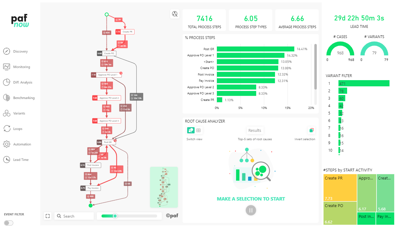
The edges and nodes highlighted in red indicate process steps that drive up the number of total steps in the process. When those process steps occur, the average number of process steps is higher than the total average of process steps in the process.
Agenda
- Next to the menu, you can see the PAFnow Process Explorer which gives you the opportunity to take a closer look at your process steps.
- Next to the Process Explorer, you can see an overview consisting of three different cards. Furthermore, the number of your process steps by Activity Names is visualized in a bar chart. By clicking one or more data points in the chart, you can activate the PAFnow Root Cause Analyzer, which is located right underneath. You can also display a column chart which shows you the number of cases grouped by the number of process steps, and the PAFnow Event Filter by clicking the Event Filter-button in the lower left corner.
- On the right side, there is a navigation bar (similar to the other pages) including different visual filter and selection elements.
Process Steps Overview
Cards
The three overview cards provide key figures on your process steps. They are explained in the table below:
| Card | Meaning |
|---|---|
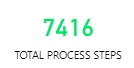 | TOTAL PROCESS STEPS This key figure shows the absolute number of all process steps throughout the process. |
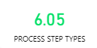 | PROCESS STEPS TYPES This key figure shows the absolute number of all unique process steps throughout the process. |
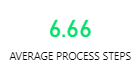 | AVERAGE PROCESS STEPS This key figure shows the average number of all process steps throughout the process. |
Bar Chart
See how often process steps are executed. This chart shows the percentage of individual process steps in relation to all process steps in the process.
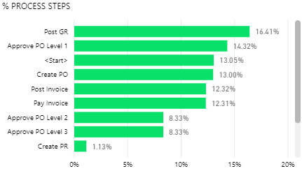
In this example the process step Post GR is the most frequent process step executed with 16.41 percent.
Process Steps Overview II
You can display the Cases grouped by number of process steps chart and the Event Filter with the Event Filter-button in the bottom left corner of the page.
Column Chart
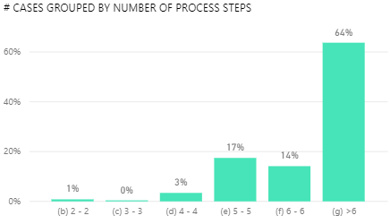
This evaluation subdivides your cases according to their number of process steps. The process steps are grouped into dynamically calculated intervals.
This chart shows that over 60 percent of cases use more than 6 process steps.
Event Filter
Here you can see specific cases by choosing a filter criterion based on following events. In the example we will only see cases where the activity Approve PO Level 1 is directly followed by the activity Create PO.
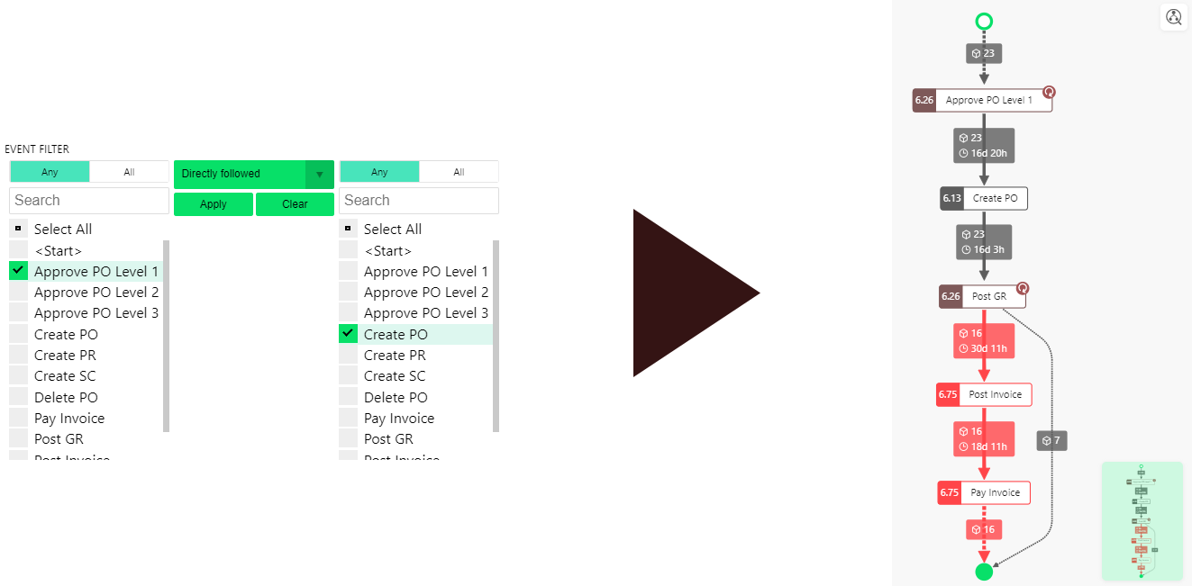
The Process Explorer adapts to the set filter and shows the 23 cases were Approve PO Level 1 is directly followed by Create PO.
Navigation Bar
With the navigation bar on the right, you can further control the process flow to receive more targeted evaluations. More details to the navigation bar can be found on the Discovery Page and Difference Analysis Page.
Ø Lead Time of Cases
The Average total lead time is visualized with the PAFnow Duration Card. It shows lead times based on your selections.

You can decide how granular the format should be (in days, hours, minutes or seconds). In the example above, the Duration Card shows the average lead time of the entire process up to the level of seconds.
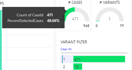
Cases and Variants
The gauge visualizations show you the absolute number of currently filtered and displayed cases and variants.
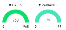
In this example all 968 cases and 79 variants are selected and shown in the other visuals.
Tip
If you want to see the percentage share of your cases or variants instead of the absolute number, then you can display the share in the tooltip by moving the mouse pointer over the green semi-circle.
Variant Filter
The PAFnow Variant Filter gives you the option to filter by one or more individual variants.
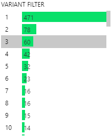
Each variant was given a unique ID during data processing (the number in front of the green bar) to better identify it for the analysis. The length of the bars depends on the number of cases that flow through each variant. The top variant with the ID 1 is the most frequent one and covers 471 cases. If you select one or more variant with the variant filter, the complete report page is filtered by your selection.
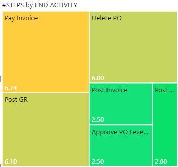
# Steps by Start Activity
The Treemap visual gives you the opportunity to filter your page by several attributes, here by Start Activity:
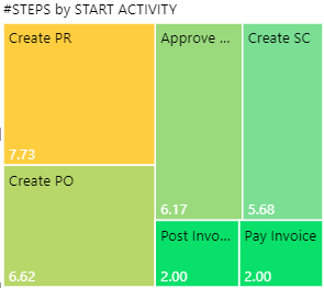
Tip
By using the Drilldown-feature ![]() , you can drill down to the next hierarchy level, here the Steps by End Activity.
, you can drill down to the next hierarchy level, here the Steps by End Activity.